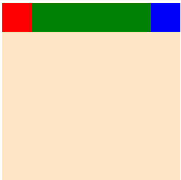
flex-basis 속성은 주축의 방향을 기준으로 요소들의 크기를 조절할 수 있습니다. flex-grow 속성은 남은 공간이 있을 때 요소들을 비율에 따라 크기를 조절할 수 있습니다. flex-shrink 속성은 요소들이 전체 사이즈를 넘어가는 사이즈를 가질 때 비율에 따라 크기를 줄일 수 있습니다.
flex-basis
<!DOCTYPE html>
<html lang="en">
  <head>
    <meta charset="UTF-8" />
    <meta http-equiv="X-UA-Compatible" content="IE=edge" />
    <meta name="viewport" content="width=device-width, initial-scale=1.0" />
    <title>Document</title>
    <style>
      #container {
        background-color: bisque;
        display: flex;
        height: 600px;
        flex-direction: row;
        justify-content: flex-start;
      }

      #container div {
        width: 100px;
        height: 100px;
        flex-basis: 500px;
      }

      .one {
        background-color: red;
      }
      .two {
        background-color: green;
      }
      .three {
        background-color: blue;
      }
    </style>
  </head>
  <body>
    <div id="container">
      <div class="one"></div>
      <div class="two"></div>
      <div class="three"></div>
    </div>
  </body>
</html>

주축이 row라서 가로크기가 조절됩니다.
<!DOCTYPE html>
<html lang="en">
  <head>
    <meta charset="UTF-8" />
    <meta http-equiv="X-UA-Compatible" content="IE=edge" />
    <meta name="viewport" content="width=device-width, initial-scale=1.0" />
    <title>Document</title>
    <style>
      #container {
        background-color: bisque;
        display: flex;
        height: 600px;
        flex-direction: column;
        justify-content: flex-start;
      }

      #container div {
        width: 100px;
        height: 100px;
        flex-basis: 500px;
      }

      .one {
        background-color: red;
      }
      .two {
        background-color: green;
      }
      .three {
        background-color: blue;
      }
    </style>
  </head>
  <body>
    <div id="container">
      <div class="one"></div>
      <div class="two"></div>
      <div class="three"></div>
    </div>
  </body>
</html>
주축이 column라서 세로크기가 조절됩니다.
flex-grow
<!DOCTYPE html>
<html lang="en">
  <head>
    <meta charset="UTF-8" />
    <meta http-equiv="X-UA-Compatible" content="IE=edge" />
    <meta name="viewport" content="width=device-width, initial-scale=1.0" />
    <title>Document</title>
    <style>
      #container {
        background-color: bisque;
        display: flex;
        height: 600px;
        flex-direction: row;
        justify-content: flex-start;
      }

      #container div {
        width: 100px;
        height: 100px;
        flex-basis: 200px;
        flex-grow: 1;
      }

      .one {
        background-color: red;
      }
      .two {
        background-color: green;
      }
      .three {
        background-color: blue;
      }
    </style>
  </head>
  <body>
    <div id="container">
      <div class="one"></div>
      <div class="two"></div>
      <div class="three"></div>
    </div>
  </body>
</html>
flex-grow를 전체 요소에 적용해서 비율이 동일하게 적용됩니다.
<!DOCTYPE html>
<html lang="en">
  <head>
    <meta charset="UTF-8" />
    <meta http-equiv="X-UA-Compatible" content="IE=edge" />
    <meta name="viewport" content="width=device-width, initial-scale=1.0" />
    <title>Document</title>
    <style>
      #container {
        background-color: bisque;
        display: flex;
        height: 600px;
        flex-direction: row;
        justify-content: flex-start;
      }

      #container div {
        width: 100px;
        height: 100px;
        flex-basis: 200px;
      }

      div:nth-of-type(2) {
        flex-grow: 1;
      }

      .one {
        background-color: red;
      }
      .two {
        background-color: green;
      }
      .three {
        background-color: blue;
      }
    </style>
  </head>
  <body>
    <div id="container">
      <div class="one"></div>
      <div class="two"></div>
      <div class="three"></div>
    </div>
  </body>
</html>
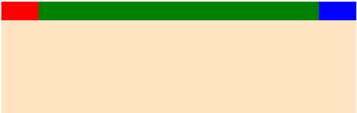
하나의 요소에 개별적으로 적용할 수 있습니다.
flex-shrink
<!DOCTYPE html>
<html lang="en">
  <head>
    <meta charset="UTF-8" />
    <meta http-equiv="X-UA-Compatible" content="IE=edge" />
    <meta name="viewport" content="width=device-width, initial-scale=1.0" />
    <title>Document</title>
    <style>
      #container {
        background-color: bisque;
        display: flex;
        width: 600px;
        height: 600px;
        flex-direction: row;
        justify-content: flex-start;
      }

      #container div {
        width: 100px;
        height: 100px;
        flex-basis: 300px;
      }

      div:nth-of-type(1) {
        flex-shrink: 3;
      }

      .one {
        background-color: red;
      }
      .two {
        background-color: green;
      }
      .three {
        background-color: blue;
      }
    </style>
  </head>
  <body>
    <div id="container">
      <div class="one"></div>
      <div class="two"></div>
      <div class="three"></div>
    </div>
  </body>
</html>
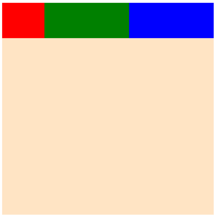
전체 사이즈와 요소들의 사이즈가 작거나 동일하다면 작동하지 않습니다. 요소들의 사이즈가 더 커야 요소를 선택해서 줄일 수 있습니다.
flex 적용
<!DOCTYPE html>
<html lang="en">
  <head>
    <meta charset="UTF-8" />
    <meta http-equiv="X-UA-Compatible" content="IE=edge" />
    <meta name="viewport" content="width=device-width, initial-scale=1.0" />
    <title>Document</title>
    <style>
      #container {
        background-color: bisque;
        display: flex;
        width: 600px;
        height: 600px;
        flex-direction: row;
        justify-content: flex-start;
      }

      #container div {
        width: 100px;
        height: 100px;
      }

      .one {
        background-color: red;
        flex: 1 2 300px;
      }
      .two {
        background-color: green;
        flex: 2 1 600px;
      }
      .three {
        background-color: blue;
        flex: 1 2 300px;
      }
    </style>
  </head>
  <body>
    <div id="container">
      <div class="one"></div>
      <div class="two"></div>
      <div class="three"></div>
    </div>
  </body>
</html>
flex 속성에 flex-grow, flex-shrink, flex-basis 순서로 입력해서 적용할 수 있습니다.
'IT > css' 카테고리의 다른 글
| CSS 미디어 쿼리 (Media Query) (0) | 2023.03.30 |
|---|---|
| 부트스트랩(Bootstrap)이란? (0) | 2023.03.30 |
| align-content & align-self 속성 (0) | 2023.03.26 |
| css align-items 속성 (0) | 2023.03.25 |
| css flex-warp 속성 (0) | 2023.03.24 |


댓글