css align-items 속성은 교차 축을 기준으로 요소들이 정렬됩니다. 교차 축은 주축의 방향에 따라서 결정이 되며 기본적으로 주축은 좌측에서 우측 방향 교차 축은 상단에서 하단 방향으로 설정되어 있습니다.
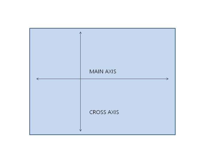
교차 축 상단에서 하단 기준
<!DOCTYPE html>
<html lang="en">
<head>
<meta charset="UTF-8" />
<meta http-equiv="X-UA-Compatible" content="IE=edge" />
<meta name="viewport" content="width=device-width, initial-scale=1.0" />
<title>Document</title>
<style>
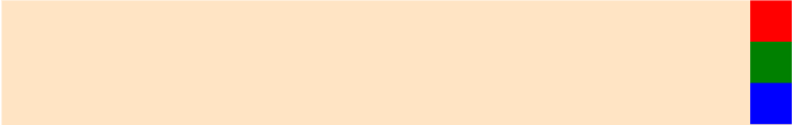
#container {
background-color: bisque;
display: flex;
height: 600px;
flex-direction: row;
justify-content: flex-start;
align-items: flex-start;
}
#container div {
width: 100px;
height: 100px;
}
.one {
background-color: red;
}
.two {
background-color: green;
}
.three {
background-color: blue;
}
</style>
</head>
<body>
<div id="container">
<div class="one"></div>
<div class="two"></div>
<div class="three"></div>
</div>
</body>
</html>
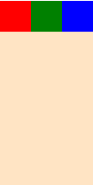
flex-direction 속성의 값이 row 이므로 주축은 좌측에서 우측이고 교차 축은 상단에서 하단입니다. align-items 속성은 교차축을 기준으로 작동하며 flex-start 값은 시작점으로 정렬해주는 기능이기 때문에 상단에 위치하게 됩니다.
<!DOCTYPE html>
<html lang="en">
  <head>
    <meta charset="UTF-8" />
    <meta http-equiv="X-UA-Compatible" content="IE=edge" />
    <meta name="viewport" content="width=device-width, initial-scale=1.0" />
    <title>Document</title>
    <style>
      #container {
        background-color: bisque;
        display: flex;
        height: 600px;
        flex-direction: row;
        justify-content: flex-start;
        align-items: flex-end;
      }
      #container div {
        width: 100px;
        height: 100px;
      }
      .one {
        background-color: red;
      }
      .two {
        background-color: green;
      }
      .three {
        background-color: blue;
      }
    </style>
  </head>
  <body>
    <div id="container">
      <div class="one"></div>
      <div class="two"></div>
      <div class="three"></div>
    </div>
  </body>
</html>
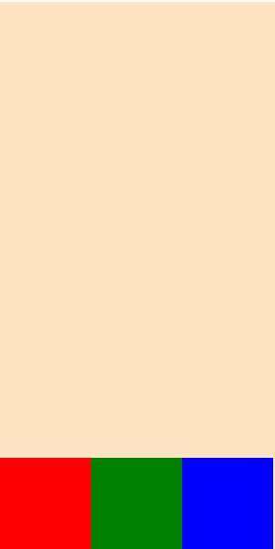
flex-direction 속성의 값이 row 이므로 주축은 좌측에서 우측이고 교차 축은 상단에서 하단입니다. align-items 속성은 교차축을 기준으로 작동하며 flex-end 값은 끝점으로 정렬해주는 기능이기 때문에 하단에 위치하게 됩니다.
교차 축 좌측에서 우측 기준
<!DOCTYPE html>
<html lang="en">
  <head>
    <meta charset="UTF-8" />
    <meta http-equiv="X-UA-Compatible" content="IE=edge" />
    <meta name="viewport" content="width=device-width, initial-scale=1.0" />
    <title>Document</title>
    <style>
      #container {
        background-color: bisque;
        display: flex;
        height: 600px;
        flex-direction: column;
        justify-content: flex-start;
        align-items: flex-start;
      }
      #container div {
        width: 100px;
        height: 100px;
      }
      .one {
        background-color: red;
      }
      .two {
        background-color: green;
      }
      .three {
        background-color: blue;
      }
    </style>
  </head>
  <body>
    <div id="container">
      <div class="one"></div>
      <div class="two"></div>
      <div class="three"></div>
    </div>
  </body>
</html>
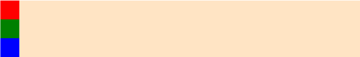
flex-direction 속성의 값이 column 이므로 주축은 상단에서 하단이고 교차 축은 좌측에서 우측입니다. align-items 속성은 교차축을 기준으로 작동하며 flex-start 값은 시작점으로 정렬해주는 기능이기 때문에 좌측에 위치하게 됩니다.
<!DOCTYPE html>
<html lang="en">
  <head>
    <meta charset="UTF-8" />
    <meta http-equiv="X-UA-Compatible" content="IE=edge" />
    <meta name="viewport" content="width=device-width, initial-scale=1.0" />
    <title>Document</title>
    <style>
      #container {
        background-color: bisque;
        display: flex;
        height: 600px;
        flex-direction: column;
        justify-content: flex-start;
        align-items: flex-end;
      }
      #container div {
        width: 100px;
        height: 100px;
      }
      .one {
        background-color: red;
      }
      .two {
        background-color: green;
      }
      .three {
        background-color: blue;
      }
    </style>
  </head>
  <body>
    <div id="container">
      <div class="one"></div>
      <div class="two"></div>
      <div class="three"></div>
    </div>
  </body>
</html>
flex-direction 속성의 값이 column 이므로 주축은 상단에서 하단이고 교차 축은 좌측에서 우측입니다. align-items 속성은 교차축을 기준으로 작동하며 flex-end 값은 끝점으로 정렬해주는 기능이기 때문에 우측에 위치하게 됩니다.
'IT > css' 카테고리의 다른 글
| flex-basis, flex-grow, flex-shrink 속성 (0) | 2023.03.27 |
|---|---|
| align-content & align-self 속성 (0) | 2023.03.26 |
| css flex-warp 속성 (0) | 2023.03.24 |
| css justify-content 속성 (0) | 2023.03.24 |
| css flex-direction 속성 (0) | 2023.03.24 |


댓글